Agreeable Gray: The Timeless Paint Color That Transforms Any Space
When it comes to selecting a paint color for your home, few options offer the versatility, sophistication, and universal appeal of Sherwin-Williams’ Agreeable Gray. As one of the most popular neutral shades on the market, Agreeable Gray has earned its reputation as a go-to choice for homeowners, designers, and builders alike. Whether you’re redecorating a single room or revamping an entire home, this warm greige hue (a blend of gray and beige) strikes the perfect balance between contemporary style and timeless elegance.In this article, we’ll dive deep into the world of Agreeable Gray exploring its undertones, versatility, pairing options, and why it continues to be a standout choice in modern home design.
What Is Agreeable Gray?
Agreeable Gray, with its Sherwin-Williams paint code SW 7029, is a soft and subtle greige color that combines the best of gray and beige. This balanced blend offers a warmth that prevents it from feeling too cold while maintaining a modern gray sophistication. It works as a chameleon color, adapting to a variety of lighting conditions and complementing nearly every design style.
The light reflectance value (LRV) of Agreeable Gray is 60, which means it reflects a decent amount of light, making spaces feel bright and airy without overwhelming them. It’s not too dark, not too light—just right for creating a comfortable and inviting atmosphere in any room.
The Undertones of Agreeable Gray
One of the reasons Agreeable Gray is so universally loved is its subtle undertones. While many gray paints lean distinctly cool or warm, Agreeable Gray walks the fine line in between.
- Warm Beige Undertones: Agreeable Gray has soft beige undertones that bring warmth to a space. This characteristic makes it particularly appealing in rooms that receive cooler natural light, as it balances out the blue tones.
- Slight Green Undertones: In certain lighting conditions, you may notice a faint green undertone. This is what makes Agreeable Gray so adaptable to natural surroundings, as it feels grounded and earthy without being overwhelming.
- Neutral Gray Base: Its gray foundation keeps the overall color neutral, so it doesn’t skew too warm or too cool. This neutral base makes it incredibly versatile for pairing with other colors in your decor.
Why Choose Agreeable Gray for Your Home?
There are countless reasons to opt for Agreeable Gray in your next painting project. Here are just a few:
1. Universally Appealing Color
Agreeable Gray lives up to its name—it’s agreeable to just about everyone. Whether your style leans modern, farmhouse, traditional, or minimalist, this paint color effortlessly fits in. Its greige tones make it suitable for nearly any design aesthetic, from cozy living rooms to sleek kitchens.
2. Timeless and Trend-Resistant
Unlike trendier colors that may look dated after a few years, Agreeable Gray has a classic quality that stands the test of time. It complements both current trends and long-lasting design principles, ensuring your home stays stylish no matter what.
3. Neutral but Not Boring
While some neutrals can feel flat or uninspired, Agreeable Gray has a depth and richness that brings character to a space. Its subtle undertones give it dimension, making it far from plain or monotonous.
4. Enhances Natural Light
With its high LRV, Agreeable Gray reflects natural light beautifully. This makes rooms feel larger, brighter, and more open. It’s especially effective in small or dimly lit spaces, where it adds a sense of airiness without overpowering the room.
How to Use Agreeable Gray in Your Home
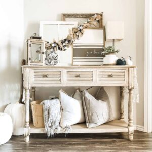
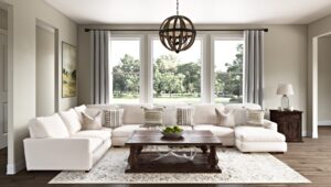
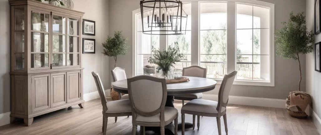
1. Living Rooms
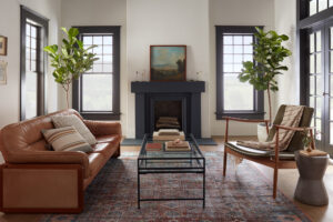
In living rooms, Agreeable Gray creates a cozy yet refined ambiance. Pair it with soft whites for trim and ceilings to highlight its elegance. Add textured throw pillows and natural wood furniture to enhance its warmth and create a welcoming space.
2. Kitchens
Agreeable Gray works beautifully in kitchens, particularly when paired with white cabinets, black hardware, or marble countertops. For a modern touch, use it on the walls while keeping cabinetry crisp white.
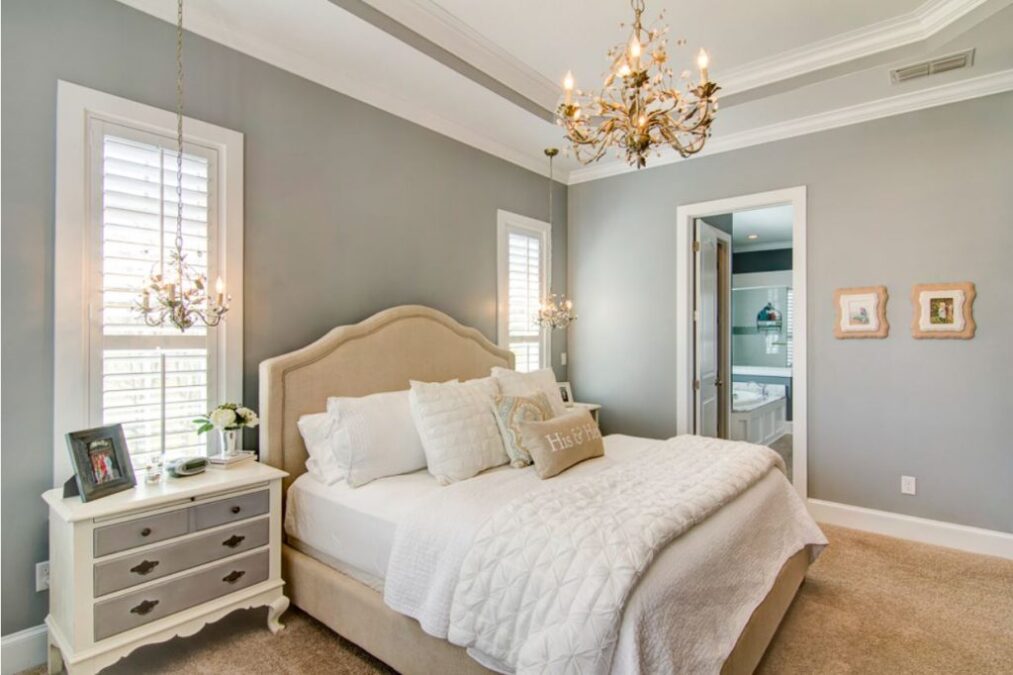
3. Bedrooms
In bedrooms, Agreeable Gray fosters a serene and calming environment. Pair it with soft blues, blush pinks, or muted greens for a tranquil retreat that encourages relaxation.
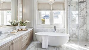
4. Bathrooms
This shade is perfect for bathrooms as it brightens smaller spaces without feeling stark. Combine it with white subway tiles, silver fixtures, and plush towels for a spa-like vibe.
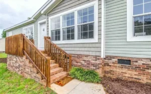
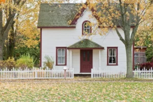
5. Exteriors
Don’t limit Agreeable Gray to your interiors—it also works wonderfully for exteriors. Use it as a main color for siding and pair it with dark shutters or crisp white trim for a polished and timeless curb appeal.
Colors That Pair Well With Agreeable Gray
While Agreeable Gray stands strong on its own, it also pairs beautifully with a variety of colors. Here are some options to consider:
- Crisp Whites: Colors like Sherwin-Williams Pure White or Alabaster enhance the elegance of Agreeable Gray, making it pop while keeping the space clean and fresh.
- Deep Blues: Navy or rich blue accents provide a striking contrast, perfect for an accent wall or decor elements.
- Soft Greens: Sage green or olive tones create a harmonious and earthy palette, especially in bedrooms or living areas.
- Warm Wood Tones: Natural wood furniture or floors bring out the beige undertones in Agreeable Gray, making the space feel cozy and grounded.
- Muted Pastels: Soft blush, dusty lavender, or pale yellow add subtle color while keeping the overall aesthetic neutral.
Tips for Choosing the Right Lighting with Agreeable Gray
Lighting plays a crucial role in how Agreeable Gray appears in your home. To make the most of this versatile color:
- North-Facing Rooms: These tend to have cooler, bluish light. Agreeable Gray’s warm undertones balance this, preventing the room from feeling too chilly.
- South-Facing Rooms: With warmer, golden light, Agreeable Gray takes on a warmer, beige-like tone. This makes the room feel even more inviting.
- Artificial Lighting: Opt for soft white bulbs to complement the warmth of Agreeable Gray, or go for daylight bulbs if you prefer a cooler, brighter effect.
Alternatives to Agreeable Gray
While Agreeable Gray is a top choice, there are other similar shades worth considering:
- Repose Gray (SW 7015): Slightly cooler and with more gray undertones, this is a great option for those who prefer less warmth.
- Accessible Beige (SW 7036): Leans more beige than Agreeable Gray but still offers a soft, neutral appearance.
- Edgecomb Gray (Benjamin Moore): A comparable greige shade with a slightly lighter, airier feel.
Conclusion: Why Agreeable Gray Stands the Test of Time
Agreeable Gray is more than just a paint color—it’s a design solution. Its warm yet neutral undertones, timeless appeal, and versatility make it a staple in modern home design. Whether you’re freshening up a single room or tackling a whole-house project, this shade delivers consistent results that never go out of style.By pairing Agreeable Gray with the right lighting, complementary colors, and finishes, you can create spaces that are inviting, elegant, and effortlessly chic. It’s no wonder this beloved greige remains a top choice for homeowners and designers year after year.So if you’re looking for a paint color that truly lives up to its name, Agreeable Gray might just be the perfect choice for your next project.